
A guide to lettering images and short headlines
Custom Font Generator: A First Walkthrough From Words to Image
Create a short lettering image
History
Know what you will make
What does this custom font generator create?
It creates an image of styled lettering from a written brief. Use it for a headline, sign concept or social graphic. The result is a raster image rather than a keyboard font or a downloadable typeface family.
How do I start?
Select Text to Image, type a short exact phrase and describe the lettering style. Choose the available image settings, review the credit quote and generate. Open the completed image in History.
Is a free attempt available?
Check the eligible credits shown in your account and compare them with the current quote. If the balance covers the attempt, you can use it. Current Pricing explains options when you need more credits.
Do I need to upload an image?
No image is required in Text to Image. If you choose Image to Image, use one visual reference for color or texture and explain what it should influence. Keep the exact words in the text description.
How much does the lettering cost?
Read the displayed credit amount for the image settings you selected. A different available size or quality can change that amount. Writing the phrase and trying wording changes do not submit a job.
How long will the image take?
The generation settings and queue affect completion. History shows the task after submission and holds the completed artwork. Check that status before starting another attempt with the same phrase.
Turn a short phrase into a lettering image with its own character. The Custom Font Generator on dotsai.pro is a place to explore brush strokes, sign-painting textures, bold shapes and color combinations. Type the exact words first, then describe how they should look. You will create a raster image for a headline or visual concept; the workflow does not produce an installable font file. This guide helps you keep the wording legible and the visual idea focused.
Create lettering artworkChoose the stroke, palette and texture
Treat wording and visual style as different decisions
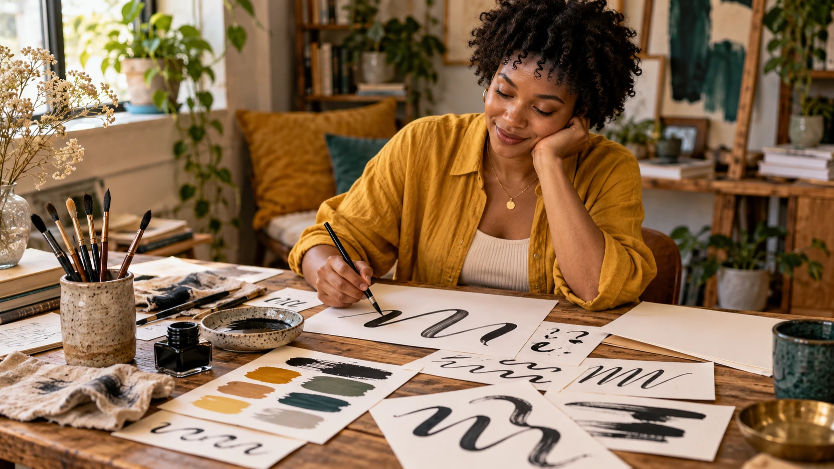
The words carry the message; the lettering treatment sets the mood. Decide what the headline needs to say before exploring visual effects. A brief phrase works well when the lettering itself is the main subject. Put the desired wording at the start of the description, then add stroke weight, texture, color and layout. Avoid surrounding the phrase with several other example words, because that can make the text instruction less clear. If you need a long message with precise line breaks, plan that text in your layout workflow and use the generated image for a shorter decorative heading.
How to create custom lettering
Lock the words before choosing effects
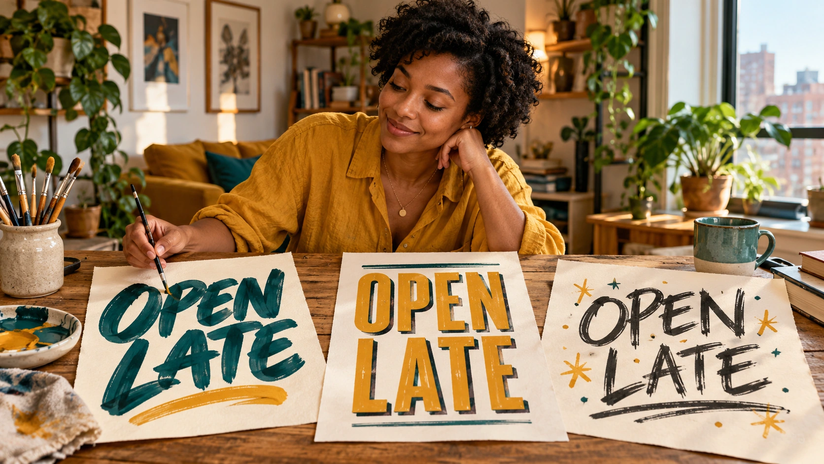
Start with a short phrase such as OPEN LATE. Put the exact words in quotation marks and state that no other text should appear. Check spelling and capitalization yourself. A short headline gives each letter more room than a long paragraph and is easier to inspect after generation.
Describe the stroke and arrangement
Choose one lettering direction: broad brush strokes, tidy block letters or a rough hand-painted sign. Name the foreground and background colors, then decide whether the phrase sits on one line or two. Leave enough margin around the letters so their ends remain inside the image.
Keep the first composition simple
Ask for clear letter spacing and a plain background before adding props, borders or elaborate shadows. If using an image reference, say whether it contributes texture or color. Review the available options and quote, then generate the lettering image when the phrase and style are ready.
Read every letter in the result
Open the completed image in History and check the whole phrase, then inspect individual letter shapes. Look for missing characters, merged strokes and uneven spacing. If the spelling is right but the style is too busy, simplify the next description while keeping the exact words unchanged.
Use texture without sacrificing the letter shapes
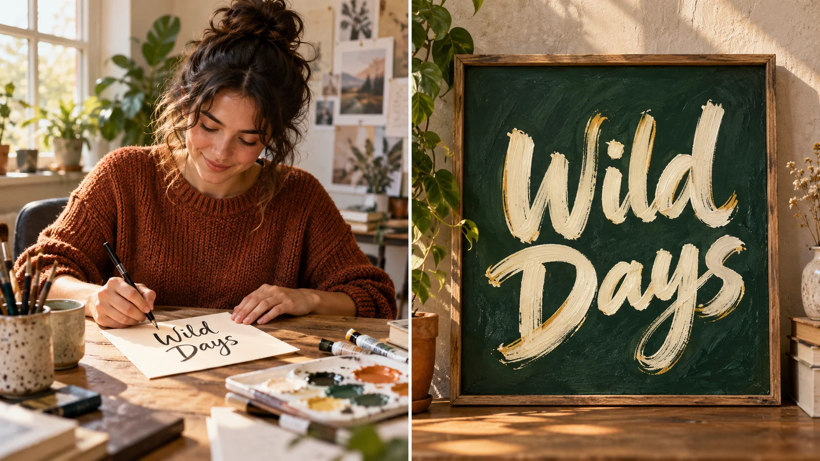
A rough brush edge can make a headline feel lively, but the underlying letters still need clear spaces between them. Begin with generous spacing and a strong foreground-background contrast. Cream lettering on deep green is one possible direction; the important part is that the strokes remain distinct at the final display size. Ask for restrained texture inside the strokes rather than heavy marks across the whole canvas. Compare the artwork as a small thumbnail as well as a large image. If you can no longer read the phrase at thumbnail size, reduce the decorative detail in the next attempt.
Check the headline in its intended setting

A welcoming studio sign
Choose two short words and a confident hand-painted stroke. Keep the background plain and use one contrasting ink color. Review every character before putting the artwork beside your own opening-hours information.
A social post headline
Create a compact phrase with room for a photo underneath or beside it. Keep the lettering separate from the photograph while exploring the idea. Select the image whose message remains readable at the size of a feed preview.
A mood board for a new visual direction
Compare a brush treatment, a block treatment and a rougher painted treatment using the same phrase. Keep the words and broad palette steady so the stroke style becomes the meaningful difference between the images.
Plan how the lettering will join the finished design
Think about the destination before selecting an image ratio. A two-line phrase may suit a square card, while a short single line can work across a wide header. Leave margins for later cropping and avoid placing the first or last letter directly against the edge. The generated image has pixels and a background determined by the request; it is not a complete typeface with reusable characters, spacing tables or an installation package. Use the artwork as an image in your design, and inspect it at the size you intend to publish. Keep important body copy in your regular text layout.
A word is missing or misspelled
Shorten the phrase and place the exact spelling at the beginning of the request. Ask for only those words and remove extra labels, slogans or example phrases from the surrounding description. Check again after generation.
The strokes merge into each other
Request clearer spacing and less decorative texture. Use a simpler letter style and a more contrasting background. Keep the phrase unchanged so you can judge the effect of the spacing instruction.
The image is attractive but hard to use
Adjust the ratio, margins and line arrangement for your intended design. Remove props that compete with the headline. Review the artwork at its final display size instead of judging only the large preview.
Custom Font Generator FAQ
Can I download a TTF or OTF font?
This page creates a raster lettering image. It does not build an installable font, a full alphabet or a typeface file. Choose it when you want a visual headline concept that will be used as an image.
Can I use my own words?
Yes. Replace the sample phrase with your own short text and specify the exact spelling and capitalization. Check every character in the completed image before using the artwork in a finished design.
Can I use an image for the palette?
Choose Image to Image when using one visual reference. Describe that reference as a color or texture direction and repeat the exact words you want rendered. Text to Image uses the written description without uploaded media.
Why does a short phrase work better for comparison?
Fewer characters leave more room to see stroke shapes and spacing. They also make it easier to identify which part of the visual treatment you want to change. Keep long explanatory copy in your regular page or graphic layout.
Where are earlier lettering attempts kept?
Use History to open the submitted jobs and completed images. Compare them with the original phrase and your style notes. Each new submitted attempt has its own displayed quote; reviewing an existing image does not generate it again.
Build the next part of your image

Prepare a group photo for the card
Create the personal image before placing a separate headline in your layout.
Try a colorful mosaic visual
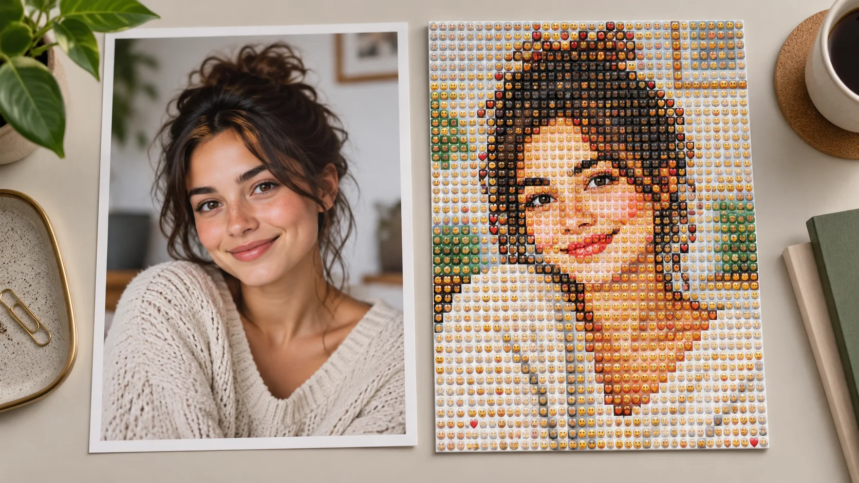
Develop a playful image to pair with a short, readable headline.
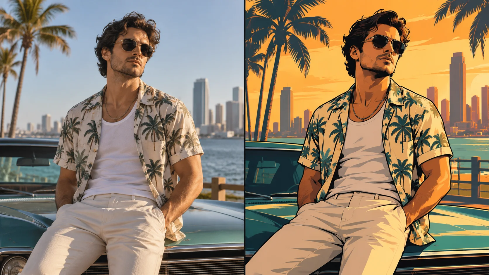
Explore a graphic urban portrait
Build a bold poster image with room for your own lettering layout.
Start with a short phrase you can read clearly
Set the exact words, choose one lettering direction and review the credit quote. Inspect spelling and spacing in History before adding the artwork to your finished design.
Create lettering artworkdotsai.pro · Updated
What's new on this page
- — Added editable example prompts and separate drafts for text and reference modes, with an action to restore the example.
- — Page content published. Updated page copy and content. Updated page images or videos. Updated page generator or navigation settings.